A quick update on the status of MCT. Tara, Seth and I gathered a solid round of feedback from many of you. We scanned it, analyzed and built a profile of updates we want to make. We noted five main issues raised by you regarding the first proposition:
- You are wondering what flexibility you’ll have. What about different colors? Flags? Logos?
- You want to know how it’ll work with other tools than Drupal
- Details are wrong, wrong flag, left&right menu are the same width, colors are wrong, languages are mixed
- The theme is not “mozzilian” enough
- The theme is “graphic” heavy.
Let me address those comments.
First, we are commited to create an extremely flexible environment for you with this theme. We are preparing it in the way that will give you ability to choose colors, layout, elements you want to put in the background, virtually anything. Beside, we will provide you Guidelines prepared by the agency that will help you work with those sources. They will just guide you on how to modify the template to keep the consistency. And if you missed that in my last post – we’ll also provide you full sources on open license so that you can modify this as you want! It’ll be a mixture of professional quality and community freedom.
Second. As I said we are preparing the template to work with several webapps out of the box, and with the freedom described above we hope you’ll contirbute with the theme suited for other apps as well.
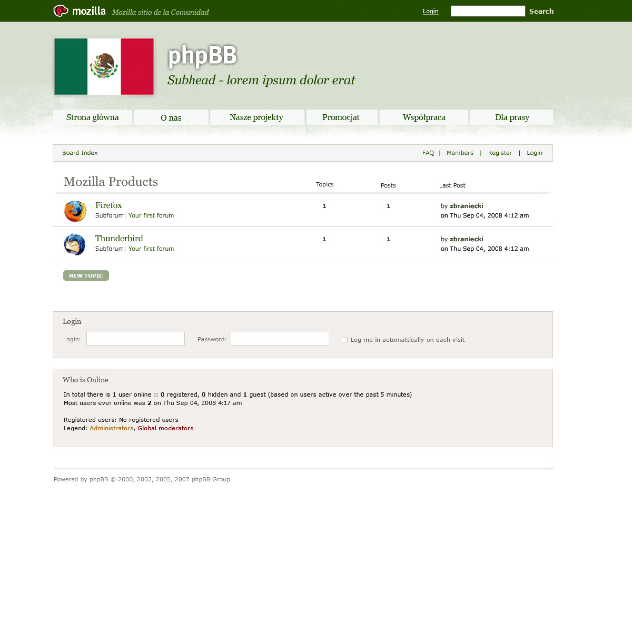
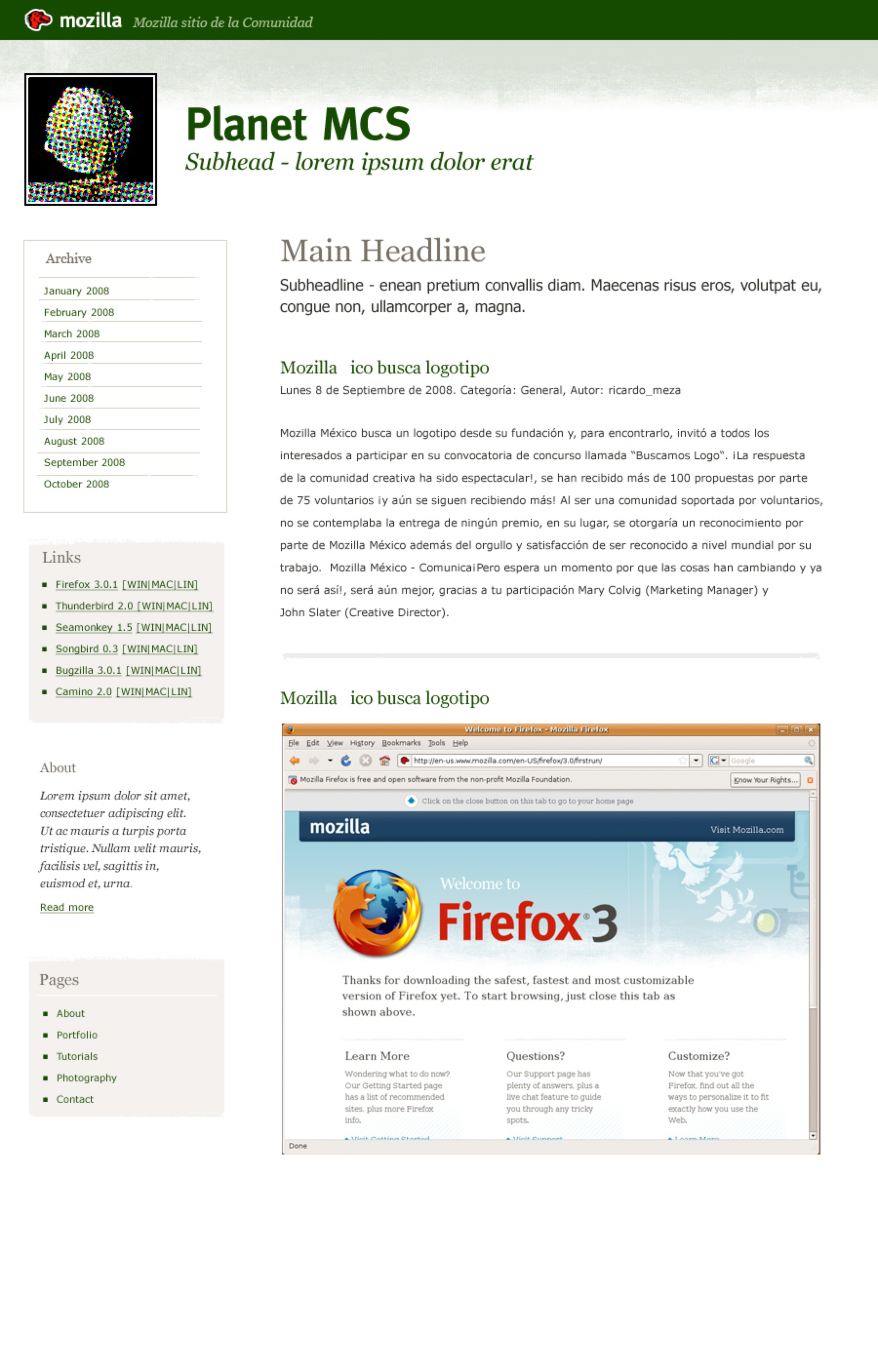
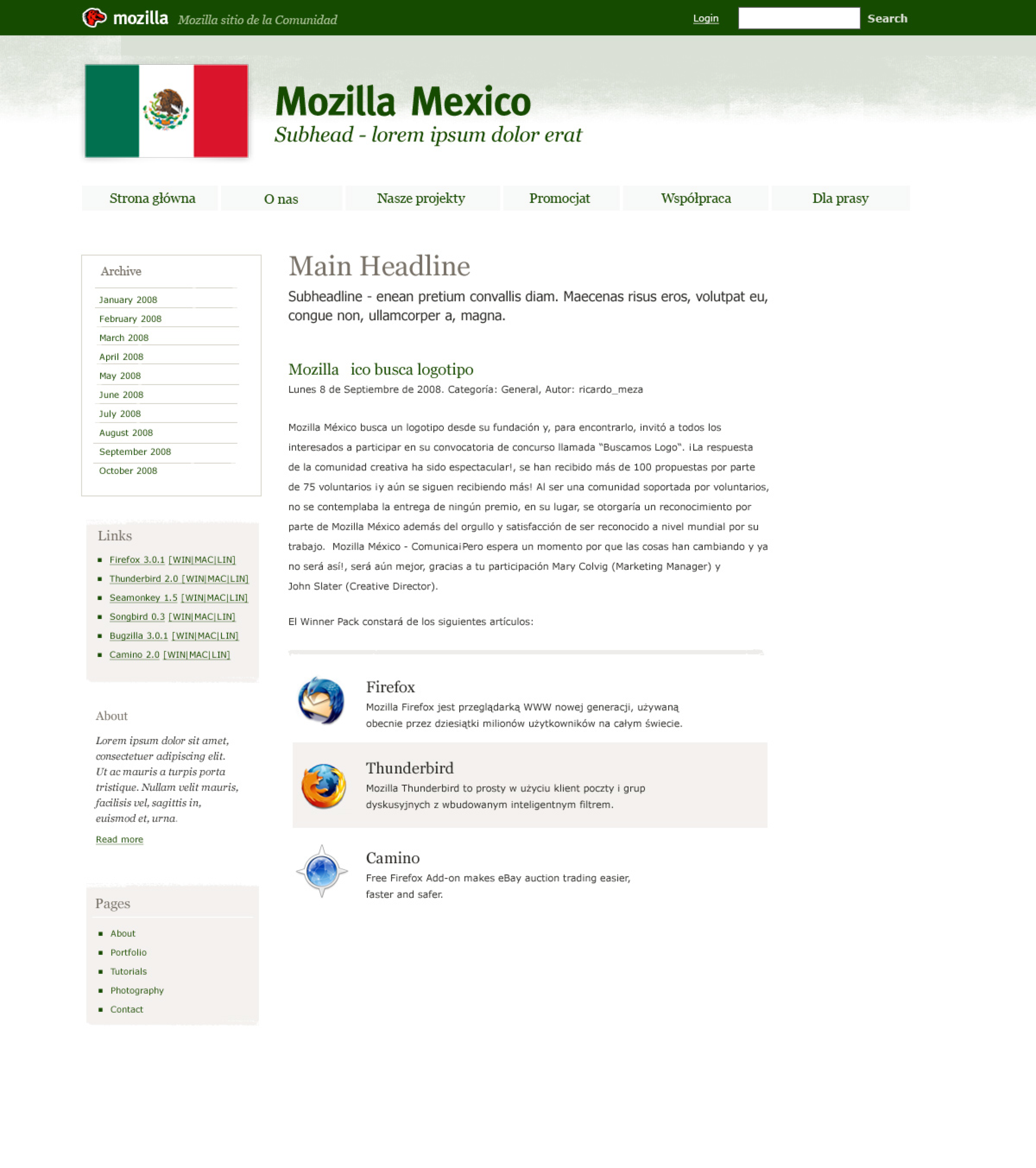
Right now, we’re preparing, among the others, php template, planetplanet template and wordpress template:


And we also have another mockup with data from a pretty complex Mozilla Community site, in this case mozilla-russia.
Please, bear in mind, that those are all mockups – elements just combined together to present how the website may look like. Of course the width of elements, choice of logo, colors etc will be up to your community, so please, forgive us a mixture of polish, russian, spanish, latin, lorem ipsum and some other languages in those mockups 😉
Of course all those mockups are from before we received your feedback (version 1), so I’m attaching them just to show you the variety of cases we’re working on. The new mockups should be ready soon.
We spent some time trying to figure out what does “mozllian” mean in terms of website template (mozilla.com? mozilla.org? developer.mozilla.org?) and we tried to minimize the influence of mozilla.com visual identification to make sure people see it as Mozilla Community – not official MoCo site. It seems we didn’t hit the right balance yet.
Regarding “heaviness” of graphics on the template. We find your comments saying that the template works great for smaller sites (majority of our community websites are in this category), but we could improve how it’ll look on more complex sites. And that’s also what we plan to address with the new round.
So. Did I get you right? Does it answer your feedback? We’re working on the next round and we hope it’ll be near to final so that we can start deploying it for you to use. Expect next round, next week 🙂
update: Just to clarify – this is an option for our communities to make your life easier. We will not enfore anyone to use it! 🙂