 Just a short note. KDE team has released KDE 4.2 today. It’s their first release of KDE4 project they consider ready for public audience.
KDE4 is a fascinating project. It is a great topic for a book. Project that started when KDE started loosing ground inside Linux DE to Gnome, when KDE became less active, less motivated and somehow drown in lack of direction they managed to build a vision, action plan, set up a clear direction and follow it.
What’s even more amazing is that they followed it despite massive criticizm they had to face around KDE4.0 release.
The vision was, and still is, extremely challenging. It’s not about “updating to current standards”. It’s about setting up new ones. They do not “follow” Windows or MacOS. They experiment to the scale rarely seen in Open Source projects which tend to choose evolution over revolution usually.
This time, we’re talking about changing metaphors for windows and desktop objects, about changing the concept of multitasking, about blending all elements of the DE into metamodels, about Jeff Raskin’s Zoomable User Interfaces, about semantic desktop (Nepomuk), consistent theming (Oxygen) and tons of smaller projects that are setting up a strong fundamentals for Linux desktop environment being unique and innovative.
In each of the dimensions mentioned above they broke some status quo.
Linux had small concept from ZUI – virtual desktops. But KDE4 decided to go for real one – full featured Activities. Spaces devoted to selected activities – am I in work or home? is it sunday or weekday? My desktop serves different purposes depending on my current activity and KDE4 is experimenting with it.
 Linux had themes, but Oxygen is the only project I know of which is community based (not company sponsored like Fedora theme or Mandriva) and brings consistency and quality to the visual message they send across icons, themes, banners, websites etc.
Nepomuk is a breathtaking project with extremely challenging goals of making desktop serve as semantic desktop platform. By this they mean ability to get valuable information about system elements. File on my hard drive was sent by John. Nepomuk will tell me that. The paragraph in my document was copied from Wikipedia, Nepomuk will store the url. The file I’m about to delete was my favorite mp3 that I rated 5 stars in my music player and played 5000 times yesterday. Do I really want to delete it? etc. This is just a teaser, but a quite interesting one, won’t you say?
Plasma is taking a widget concept several light years forward. We all agree that everyone took MacOS’s concept of widgets and it was good. But Plasma is making everything on the desktop a widget, or plasmoid as they call it. Task bar is a plasmoid. Start menu is. Clock in your task bar is and notification is. Everything is a plasmoid and plasmoids adjust to the area they are presented in. You can add a contact list on your desktop, but if you drag&drop it to taskbar it will present differently. Or you can take your fancy rss reader and d&d to top panel to make it switch into a scrolling rss reader fitting your bar.
It’s just a teaser. There are much more projects like solid, sonnet, decibel, okular, marble (google earth for open source) and more. The vision is exciting and they had to expose it in order to bring polish and quality to elements they built. That’s what KDE4.0 was and it received a lot of bad press for being not ready to use. KDE4.2 is the first release that gives a solid user experience but what’s truly amazing is that inside the concept of KDE4 there’s room for breathtaking KDE4.3, KDE4.4, KDE4.5 and forward and from now on, each next release will have to focus on things not known in other desktop environments.
Today, if you compare planetkde with planet.gnome (maybe not today, because of the release, but on average day) its such a striking difference with 10-15 blog posts per day on KDE planet with new projects, concepts, mockups, experiments vs. Gnome planet which gives you rarely any idea on what is going on and what you can expect from the next version. (or just look at KDE4.2 feature plan, and Gnome 2.28 plan).
What an amazing flip. I hope gnome will use this time to revitalize itself into Gnome3 vision.
Just following KDE experiments is exciting. It’s a pleasure to watch such healthy and vibrant open project that dares to travel on an uncharted map and delivers promise of Linux DE experience becoming innovative and unique.
If you didn’t try KDE4 yet (lucky you), now its the time to give it a try 🙂
5 replies on “KDE 4.2 released”
4.2 is very good release.
BTW: could you check out and tell us what’s happening with firefox-qt? please, please, please, please… 🙂
Yep, Firefox for KDE 4.x would be very nice. Compiled with qt or at least integrated in KDE…..
Sounds like you’re sold on KDE! I read that Nokia plans to license Qt as LGPL, which is a great step forward.
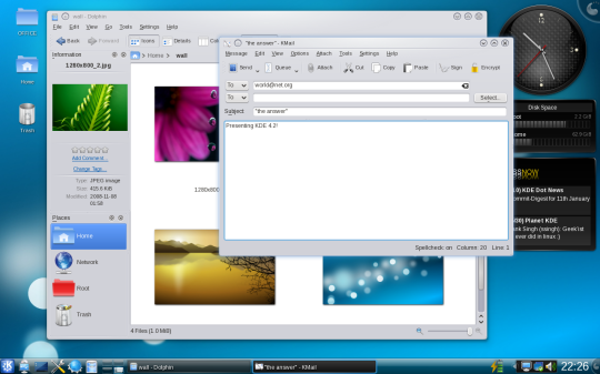
Looking at the screenshot you included, I can’t help but notice that it looks like an exact replica of Windows Vista, which doesn’t really communicate “setting up new” standards or choosing “revolution” instead of “evolution.” I know, there’s more to it than the surface, but since the surface is so heavily touted as a major change in KDE4, it’s somewhat discouraging that it looks so similar to what we’ve had in the last 13 years or so (starting with Windows 95).
KDE never became less active. It is always a vibrant and active open source project. What made it looked less active was because KDE did not release any major version for quite long. The vision about KDE 4 had been started as early as 2005, so they have a clear vision about KDE 4. And now their vision begins to become clearer for end users.
Thanks God they didn’t just cut the path and please the user with temporary “cosmetic” surgery. Instead they remake the whole things, and they have put a very solid technologies as their foundation for the next few years, until KDE 4 shows its age and they will begin a new cycle…
> Sounds like you’re sold on KDE!
Not as a user. I use MacOS and Gnome. But I love observing KDE 🙂
> I read that Nokia plans to license Qt as LGPL, which is a great step forward.
QT4.5 is released like that.
> I can’t help but notice that it looks like an exact replica of Windows Vista
Interesting. I don’t have this kind of observation
> it’s somewhat discouraging that it looks so similar to what we’ve had in the last 13 years or so (starting with Windows 95).
You may be right. I believe that it is a kind of run to reach KDE3.5 parity so that people can switch and focus on working on new stuff…
> KDE 4 had been started as early as 2005
Actually, I was a part of original community brainstorm on KDE4 in 2004 😉
btw. I received another comment from “Giacomo’, who did not leave his email to contact him. The comment brings insights into how Gnome is developing but contains so much aggression that I did not decide to push it. If you read this, please, resend your comment without agressive attacks. Thanks