We’re listening to you and we’re excited about your ideas 🙂
Some time ago, Staś and Seth started a survey program to get an idea on what You feel about Mozilla. And in the very first survey they led, the very most commonly requested support from Mozilla was to provide Mozilla website template for community sites.
We were not surprised to see this in the survey results because it has been something that many of us have been considering a long time. How could we find creative ways to support all of our Mozilla contributors? How can we make life easier for everyone? We have all levels of communities, from large to small and new to old. Many do not have all the resources needed to create this on their own.
That’s exactly how Mozilla Community Sites project started. We’re going to work on customization of several commonly used community webtools to make it easy to set up and deploy a website for your community. If a contributor community chooses to use the tools provided, they can get a site up and running that looks like a Mozilla Community project website, with several features built in specific that do not requiring mastering PHP/MySQL etc. (but if you want, feel free to support us with your skills :)).
The tool presents several commonly used webtools like Drupal, WordPress, phpBB/punBB, PlanetPlanet etc. and prepare them to be ready to start in the Mozilla community environment. We’re planning to offer two kinds of websites:
- powerful and highly customizable website using Drupal CMS
- smaller, easier to deploy and less interactive based on WordPress.
We want these sites to easily feed from Mozilla Developer Center, SUMO, QMO and list latest stable releases in your language.
We also intend to use Single Sign On, OpenID, and other features to improve integration.
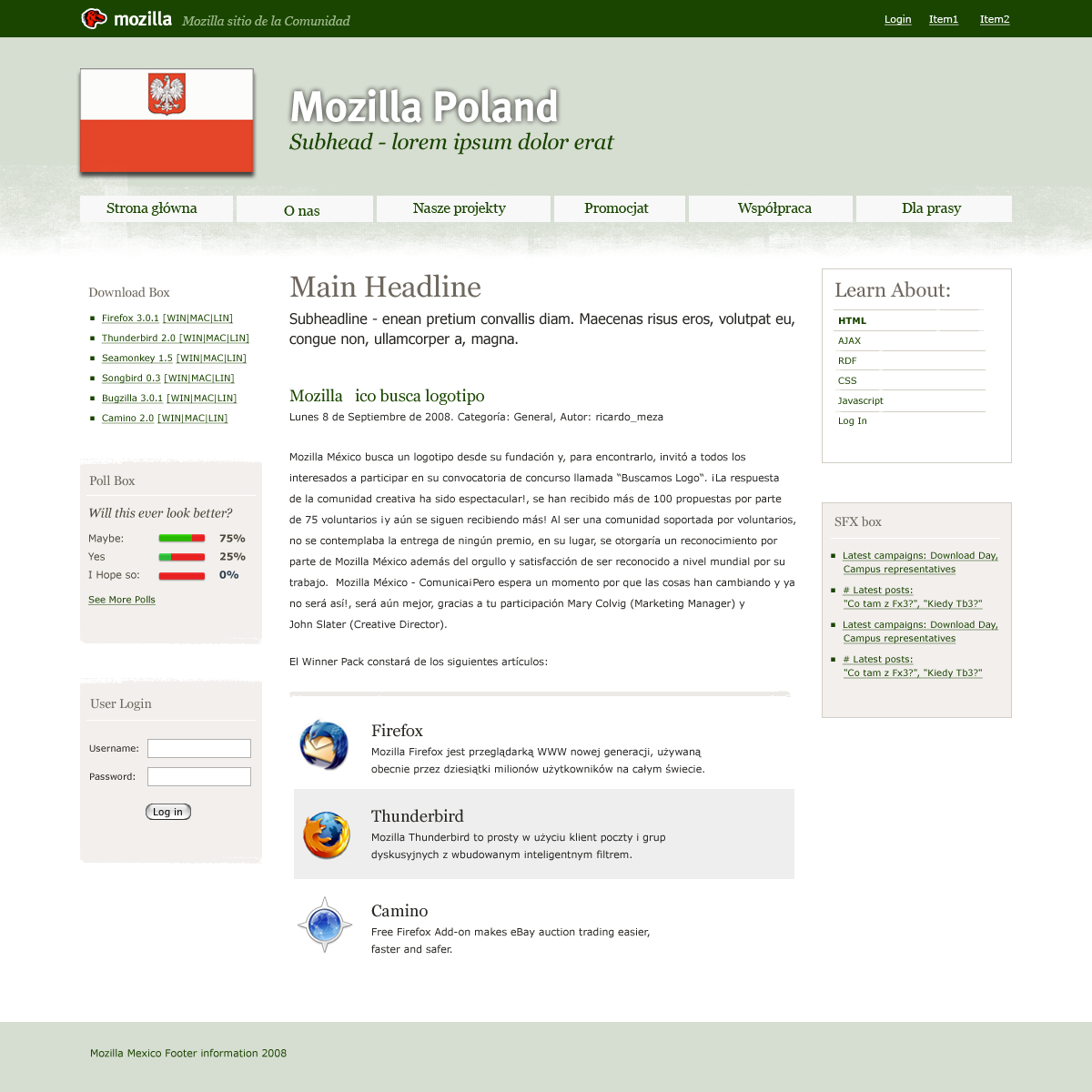
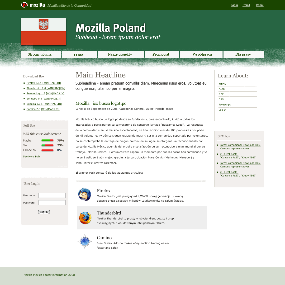
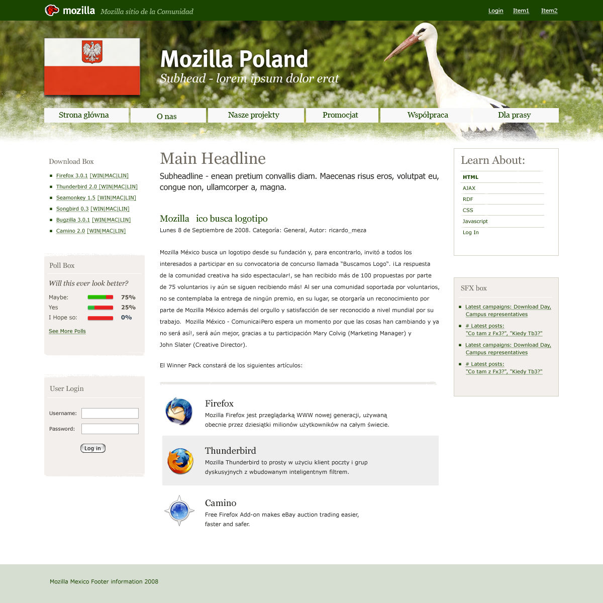
One featured below is a much requested Mozilla Community Theme.
From the survey, we gathered that people wanted a theme that clearly indicated that websie was part of the Mozilla Project, while at the same time not an effort from the Mozilla Corporation or Foundation.
We worked with designers to help us create something that had a feel somewhere close to the Corporation and Foundation sites, but still unique and different.
And today, I’d like to present you the draft and ask for you feedback on it!
Below is the screenshot of how the website could look like.


The content presented on the screenshots above is of course just an example. Website maintainer will decide what to present there.
Also, the theme is not obligatory to anyone. It’ll be just an option you can use while preparing your website. We appreciate and respect how our communities are independent.
We will also provide you a special Guidelines that will help you customize the template according to your needs (changing colors – green, orange, blue etc., backgrounds, etc.). These guidelines are intended to make it easier to modify the template if you want to skin another webtool from outside of our list with this theme while still maintaining quality.
Just to be clear, with this tool you will be able to select the following:
- components you want to display (top header, header bar, left, right panels, etc.).
- colors to use (Guidelines will provide a list of color pallets that fits the theme well)
- ideas to put in the background (maybe something specific to your community – Eiffel tower in the header background?)
- community logo.
We will suggest you to follow those Guidelines, but if you want to go beyond, feel free!
Oh, and… the theme will be, of course, open sourced 🙂
So, now, that we spent some time with designers on this, we need your feedback before going any further. We need to know what you think, would it fit your community if you lead one, which kind of community does this mockup fit, what could be improved to fit others, what can we do better and what is missing. It’s especially crucial to find out what’s missing to make sure it’ll be covered with the final version. Please, focus on clear, productive feedback. Thanks! 🙂
22 replies on “[RFC] Mozilla Community Theme”
Hey there!
This is great! really, We, the Mozilla México community, are working to create our community website, we have a Hosting sponsor, we decided to use Drupal because our community will grow up because Mexico have a lot of linguistic derivations, phpBB for forums and a Wiki for some documentation.
I think the template is clear and visually pleasing and as you comment, if we have the opportunity to modify color, background images, a logo and also we have the opportunity to decide the template elements to use is so cool!
We can use it right now! what do you think?
I cannot see how this theme relate to any “Mozilla look”
Currently, the communities around language have their own community web-presence where-from they talk about their involvement in Mozilla. For such communities, what is the value that can be added from this presence ‘on’ the Mozilla URL ?
Ricardo: please, give us some time to polish the theme. I’ll contact you once we have a final version, and you’re very welcome to help me make it into drupal theme 🙂
Jesper: What is missing for you?
Sankarshan: I’m not entirely sure if I understand you, but let me try to answer. First of all, this is supposed to be a solution for cases when you don’t have designer in the team, and instead of spending time or money on finding one, we’re offering you a Mozilla Community theme ready to use. The value is a professional look&feel of a website in some cases, in others, there may be no value for now, and then you’ll use your theme, right? 🙂
I’m interested in technical documents about how to properly configure Drupal for content website (pretty urls, site structure, etc). Is it on your TODO list?
Tomer: Yes. We will provide full documentation on how to configure Drupal
I like the first theme the most. In the second one the green-blue color doesn’t look good to me (but maybe that’s just me 🙂 ).
Like Jesper, I’m missing an eyecatcher that makes it obvious to me that this is the site of a Mozilla-community (apart from the logos in the middle of the page of course 😉 ). I think the Mozilla.org theme is so popular, because it’s so recognizable to everyone.
I would suggest to add some items to this template that are specific to Mozilla.org. E.g. exchange the white buttons in the header with the half-rounded ones, the straight corners of the boxes with rounded corners (see the header of Mozilla.org).
I missed some key features: an RSS-icon and a search-box. Both of them could be integrated in the top-bar.
It needs still some work, but I think it’s a great idea to develop a Mozilla-community ‘brand’.
I believe that some of us use the CSS from mozilla.org for l10n sites now, will the new CSS compatible with it? In other words, will .feature-content still for the feature content block?
Good job! The theme looks good. The 3 objectives I’ve noticed from users visiting us are: 1) getting software (products and add-ons), 2) getting help and 3) helping out. The theme seems to let us enough space to do an organization for that. 1) seems mostly covered, 2) and 3) are manageable between the main content and the side boxes.
Will there be another color palette? In a country with a green and red flag, I’d prefer something that wouldn’t hide the green ;).
I agree with Jesper Kristensen and Ben. You might as well use any template you can find on the internet and then place a Mozilla icon at the top. Besides the header too heigh, stealing too much of the space.
2th theme looks fine (it’s similar to Gran Paradiso t-shirt 😉 Keep in mind, that all sites must be displayed properly on mobile and handheld devices with smaller displays and resolution. Maybe it will as optional plugin in site configuration interface, maybe CMS must detect this devices automatically. Just my 2ct 🙂
The themes look good, but as Jasper noted above there is nothing “Mozillish” in them. I would like the theme to reuse some ideas/images/concepts/colors/ from current mozilla-europe site. It is great, I want more of this.
I must agree with Tim, the design of mozilla.com/mozilla-europe.org looks very professional and eye-catching, while the concept of the community team looks more like a customized theme based on some free templates available on the net in no cost.
Big headers and graphic-heavy are great for small website with just few pages; for sites with more than five pages of content (such as a community forum or a wiki), I would prefer a theme similar to mozilla.org which will make it more functional – Less space reserved for header, and more space for content.
I know the open license permits use of that themes, maybe we should make it more official, but with some tweaks, such as a utility (based of imagemagick or gd) to let each community decide which colors they prefer in the theme, where CSS is not an option.
Well, I have to agree with Tomer, Tim and Jasper. Apart from the logos and the use of FF Meta Bold in the header, there’s nothing really “mozillish” in this theme. It doesn’t look similar to Mozilla.com, AMO and MDC, and it doesn’t look like mozilla.org either.
I am not saying these mockups look bad, they just don’t have the Mozilla feel in them.
Also, you really can’t use the state ensign (the variant of the Polish flag with the coat of arms in the white part) here, this is illegal. 🙂
I think the pipes on mozilla.com are a terrific idea, and create a strong visual identity for the Mozilla project at this point. They don’t have to be in the main background, but featuring them somewhere would be a plus. Also, mozilla.com’s footer creates a very distinctive symbol that could be used here.
Speaking of the background: I think it should extend more downwards. Right now there is a very strict separation between header and main content, which together with two sidebars and top menu (come on, has anyone spent even 3 minutes to design this menu?!?) looks extremely similar to what phpnuke was like in… oh wait, it’s still that bad 😉
It will be hard to create a universal theme if we don’t know what purposes each site will serve. We have to choose to focus on:
* connecting people (planet, forum), or
* download, or
* evang/support (links to MDC, SUMO), or
* creating the ‘About’ page for your team.
Of course, some of these can and will go together, but maybe we should try to think about 4 different types of themes?
Hi.
I’m really glad to see where you are going with this. The first comment I’d like to make is that I see many hard lines and sharp edges. I think more rounded buttons and corners and not so strong contrasts would be more eye-friendly.
Also, i see 2 login fields: one on the top right and one on the left. Isn’t one enough?
The two equal-sized side columns look a bit confusing to me. I think one should be thinner than the other, so the readers have a visual guidance regarding the relevance of the content: the links to be used more frequently are to be on the broader column and the least used and “unimportant” ones on the other one.
You could also provide a two-column theme, as some teams might prefer that and I’m also a fan of two-column themes.
And I think, too, that you need more Mozilla-related objects in there.
[…] A quick update on the status of MCT. Tara, Seth and I gathered a solid round of feedback from many of you. We scanned it, analyzed and built a profile of updates we want to make. We noted five main issues raised by you regarding the first proposition: […]
The themes look good. The second one is prettier.
I would prefer an wordpress based site than a Drupal one (drupal looks harder to use).
Also it would be nice to allow the communities to choose between two and three columns layouts, and easily customize what to show on the sidebar.
Asrail: You will have a choice of course 🙂 And regarding number of columns, you’ll choose it from admin panel in Drupal or WordPress.
It’s good news having this template available! I must agree with the others, though. I’d like it more Mozilla-like. Users will identify Mozilla colours and main style, and that would help giving the locales a more “official” look&feel.
On the other side, I think just providing a 3-column theme is OK. It’ll stimulate locale teams to show polls, which will be useful for the locales and for Mozilla.
[…] weeks ago we asked you for feedback on an initial round of Mozilla Community Theme mockups and we received plenty! Then, we started […]
[…] functionality and supports the more complex, dense websites that larger communities have. We tested various layouts and documented our progress along the way, incorporating your feedback into the […]