It’s been a while since the last update on MCS but things were moving on and it’s time to catch up with the progress in the project.
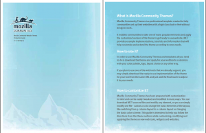
Today, I’d like to introduce you to a new Mozilla Community Theme style guide. MCT Style Guide is a document that explains the design decisions made by the theme authors that allows people who use the theme to extend it following the original concepts and keeping their new elements in sync with original one.
Rationale
Mozilla Community Theme was created to give us a fresh theme that can make it easier for communities to set up a professionally looking website without having to look for a designer or crafting something on their own. Three months after the release, MCS is becoming a popular option among o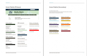 ur communities when they’re making their choices with regard to the website. We like to think that the reason is because we offered maximum freedom and flexibility with this set, letting people do what they want, while providing high quality of the design itself.
One element that we did not cover very well until today, was how to extend the theme. How to move forward. Not only modify what we gave you, but also add new elements, theme new websites, or T-shirts, or posters… That’s where the Style Guide hits.
Style Guide
Style Guide is a short book that presents the concept choices together with list of modification options that, in the theme author’s opinion, will match the theme and let you keep the unified look and feel no matter where you’ll go.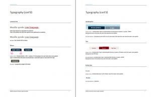
What’s exciting about it, is that it opens communities to a new level where they have all the tools and resources that usually professional web agencies have and they can develop their skills and get accustomed to the new concepts. While working on our hobbies, we’re getting real experience that translates directly into our portfolio.
 This Style Guide lets you dig into:
- color palettes
- typography decisions
- layout and grid models
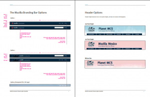
- branding options
- methods of preserving space and light between text blocks that influences readability of the text
- texture options that influence how the website looks
- and others…
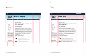 We hand this to you, so that you can experiment and develop the theme further or just customize it to your needs. What’s really important and exciting is that as all other parts of this project, the style guide is open! You can download Indesign document or editable PDF document and hack the Style Guide itself.
I’d also like to use this moment to thank Tara Shahian and Seth Bindernagel who have worked together with the theme authors on this 1.0 release of the guide. 🙂
So, grab it here and… we’re accepting patches 🙂
