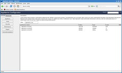
I had a free hour during BarCamp today, so I started reworking about:config UI for Gecko based apps.
Live demo (for Gecko apps)
And here’s a wiki page for the project (it’s private project, no promise that Flock or Mozilla will want to use this approach ever!)
Comments? Ideas?

One reply on “XulRunner apps, about:config new UI”
Filter input should be much longer in my opinion. Screen wide, to be exact.
I don’t like the way you put so many plain buttons. 🙁
I always wanted to see some kind of slider near integer field (when you edit value for property // dbl click). Typing by hand is irritating, using mouse is not. 😛
But nice job, anyway. Present about:config is too cluttered, it’d be nice to see improved version of this mockup in action.
PS: I’d like to see bigger comment field here, now I can’t breath. 🙂