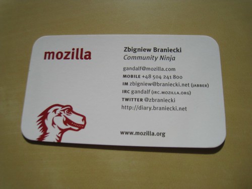
Recently I asked Mozilla for new set of business cards. The overall concept of paper cards you give to people is becoming less appealing and I definitely like the “google me” approach, not only because that’s what we really do to find someone, but also because it expresses Google’s vision and theme.
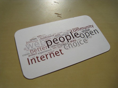
Since I was able to choose the back of the card, I started wondering… How to express Mozilla theme? How to express Mozilla?
After a few hours of trying and failing to produce anything that would even remotely give me the feeling, I went to Mark Surman’s blog for inspiration and found his blog post about visualizing Mozilla in one sentence with wordle. *Click*
Then it went fast. Took similar approach, copied all comments with suggestions, sorted them, gave to wordle which produced this. From there, I used Gimp to resize it and boom, done. Let me know what you think 🙂


7 replies on “Express Mozilla”
Really cool. I put one of these on my desk — the wordle makes a really nice and meaningful decoration. Great job, Gandalf.
Really nice, maybe I will copy you 🙂
This is a great idea. I was going to do something similar, running the Mozilla Manifesto through wordle. Wordle is sort of finicky in terms of reproducing a certain look and style. Can you tell us exactly what parameters you gave it in terms of fonts, colors, etc? Also, did you just did a screen capture from wordle, or did you do something else to generate the image?
I am also considering copying 😉 Great idea!
Looks great Gandalf!
Frank: The exact wordle settings were:
– color: Heat
– font: Lucida Sans
– layout: horizontal, rounded edges
then press relayout with current settings about 200 times and you’re done. I did not modify the wordle result except of resizing.
Have fun 🙂
Really nice.